


Page 5 - CC2018_ID_Look_Inside
P. 5
Working with Anchored Objects For complex applications — such as moving an anchored
object outside a text frame — you can choose Custom in
The Anchored Object Options dialog box controls the posi-
tion of an anchored object relative to text where it is placed.
the Anchored Object Options Position menu.
The Relative to Spine option, which aligns objects based
INDESIGN FOUNDATIONS Using the Inline on the center spread line, is only available if your layout has InDesign Foundations
facing pages. When selected, objects on one side of a spread
(such as a sidebar in the outside margin) remain on the
option, the object
aligns to text baseline;
outside margin even if the text reflows to a facing page.
you can move it up or
down relative to the
The Anchored Object Reference Point defines the loca-
tion on the object that you want to align to the location on
baseline by adjusting
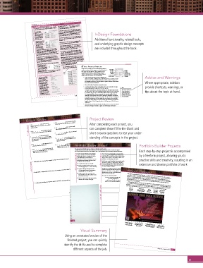
Additional functionality, related tools,
the Y Offset value.
The Anchored Position Reference Point defines the
Using the Above Line
option, the object can the page.
be anchored to the page location where you want to anchor an object. and underlying graphic design concepts
left, right, or center of The X Relative To field defines what you want to use as
the frame. If you’re the basis for horizontal alignment — Anchor Marker,
using facing pages, Column Edge, Text Frame, Page Margin, or Page Edge. The are included throughout the book.
you can also choose
Toward Spine or Away from Spine so the object will be X Offset setting moves the object left or right.
placed in the appropriate position relative to the spread
The Y Relative To field specifies how the object aligns
center. Space Before defines the object’s position relative to
vertically — Line (Baseline), Line (Cap Height), Line (Top of
the bottom of the previous line. Space After defines the
object’s position relative to the first character in the next line.
Edge. The Y Offset setting moves the object up or down.
When Keep Within Top/Bottom Column Boundaries is
By default, you can use the Selection tool to drag an Leading), Column Edge, Text Frame, Page Margin, or Page
checked, the anchored object stays inside the text column if
anchored object up or down (in other words, change its
position relative to the text to which it is anchored). If the
reflowing the text would otherwise cause the object to move
Prevent Manual Positioning option is checked, you can’t
the frame if the anchoring text is the first line in a column).
drag the anchored object in the layout. outside the boundaries (for example, outside the top edge of
If you manually position an anchored object by dragging, This option is only available when you select a line option
such as Line (Baseline) in the Y Relative To menu.
InDesign allows you to
monitor the position of The anchored object is outside the text Apply ChArACter FormAtting
anchored objects relative frame; it is positioned with custom values.
to the text in which they Once text is in a frame, you can use character formatting Font Family
are placed. When text
threads are visible (View>Show Text Threads) a dashed blue attributes to determine the appearance of individual letters, Font Style Leading
line identifies the position of anchored objects. such as the font and type size. These attributes can be Font Size Tracking
controlled in the Character panel (Window>Type &
Tables> Character) or the Control panel (depending on Kerning Horizontal Scale
Creating Anchored Placeholders which options are visible in the Control panel). Vertical Scale Skew (false italic)
Language
You can use the Object> • A font contains all of the characters (glyphs) that Baseline Shift Advice and Warnings
Anchored Object>Insert make up a typeface, including upper- and lowercase letters, numbers, special
option to define an
inline placeholder object. characters, etc. (Fonts must be installed and activated on your computer to
You can create a frame be accessible in InDesign.) The font style is a specific variation of the selected Where appropriate, sidebars
(unassigned, graphics, font, such as bold or condensed.
or text) of a specific size • Size is the height of a typeface measured in points.
and apply object and
paragraph styles if those • Leading is the distance from one baseline to the next. By default, InDesign provide shortcuts, warnings, or
exist. The Position options automatically applies leading as 120% of the type size. Note:
are the same as those You can use the Up and
in the Anchored Object InDesign treats leading as a character attribute, even though leading controls Down Arrow keys to tips about the topic at hand.
Options dialog box. (You the space between lines of an individual paragraph. (Space between paragraphs
can always resize and is controlled using the Space Before/After options in the Paragraph panel.) nudge paragraph and
To change leading for an entire paragraph, you must first select the entire
reposition the object later.) Project 2: Festival Poster 125 character style values
when the insertion point
paragraph. This approach means you can change the leading for a single line
of a paragraph by selecting any character(s) in that line; however, changing the is in a panel field.
leading for any character in a line applies the same change to the entire line
that contains those characters. (You can change this behavior by checking the
Apply Leading to Entire Paragraph option in the Type pane of the Preferences
dialog box.)
• Vertical Scale and Horizontal Scale artificially stretch or contract the selected
characters. This type of scaling is a quick way of achieving condensed or
expanded type if those variations of a font don’t exist. Type that has been
artificially scaled in this fashion tends to look bad because the scaling destroys
the type’s metrics; if possible, you should always use a condensed or expanded Note:
version of a typeface before resorting to horizontal or vertical scaling.
Tracking and kerning are
• Kerning increases or decreases the space between pairs of letters. Kerning is applied in thousandths
used in cases where particular letters in specific fonts need to be manually of an em (an em is
adjusted to eliminate a too-tight or too-spread-out appearance; manual kerning technically defined as
is usually necessary in headlines or other large type. (Many commercial fonts width that equals the
Project Review
have built-in kerning pairs, so you won’t need to apply too much hands-on
Project Review 6. The _______________ can be used to copy type • Tracking, also known as “range kerning,” refers to the overall space between a
type size).
intervention with kerning.)
formatting from one type element to another.
After completing each project, you
range of characters.
1. The _______________ tool can be used to 7. The _______________ panel is used to apply • Baseline Shift moves the selected type above or below the baseline by a specific
draw the direction and position of a gradient
fill in the blank 2. The _______________ menu command reveals 8. _______________ are objects that are attached • Skew artificially slants the selected text, creating a false italic appearance.
number of points. Positive numbers move the characters up; negative values
can complete these fill-in-the-blank and
within a frame.
move the text down.
optical margin alignment.
This option distorts the look of the type and should be used sparingly (if ever).
characters such as paragraph returns and tabs.
short-answer questions to test your under-
to specific areas of text.
3. _______________ is the space between
standing of the concepts in the project.
specific pairs of letters. To change this value,
image after its scaling in the layout has been
you have to place the insertion point between 9. _______________ is the resolution of an 114 Project 2: Festival Poster
two characters. taken into account.
4. The _______________ is the theoretical line on 10. _______________ compression for raster
which the bottoms of letters rest. images is lossy, which means data is thrown Portfolio Builder Projects
Portfolio Builder Project
away to reduce the file size.
5. The _______________ indicates that more text Use what you learned in this project to complete the following freeform exercise.
exists in the story than will fit into the available
Carefully read the art director and client comments, then create your own design to meet the needs of the project.
frame (or series of linked frames). Use the space below to sketch ideas; when finished, write a brief explanation of your reasoning behind your final design. Each step-by-step project is accompanied
As the director and playwright, I was inspired by
Your local community theater is planning a
by a freeform project, allowing you to
summer production of “Down the Yellow
Gregory Maguire’s unique rewrites of classic fairy
“The Wizard of Oz” meets “Alice in
happen if the characters from different books met
Wonderland.” You have been hired to create
1. Briefly explain how transparency is applied to objects in an InDesign page layout. art director comments Brick Rabbit Hole,” a satirical mash-up of client comments tales. But then I started to think about what would practice skills and creativity, resulting in an
somehow... and this play is the result.
several pieces to advertise the play in local
I don’t want to spoil anything, but some real sparks
media and in the community.
fly when the Queen of Hearts and the Wizard of
short answer To complete this project, you should: Oz get together! And the wicked witch, well, she’s extensive and diverse portfolio of work.
got her hands full trying to escape the clutches of
o Design a half-page advertisement for the
an army of talking caterpillars.
local newspaper (11.5 10.5 trim size).
This play is one-third mystery, one-third dramedy,
o Design a full-page advertisement for
2. Briefly define a clipping path; provide at least two examples of how they might be useful.
and one-third just plain silly! It’s got star-crossed
the community arts and entertainment
magazine (8.5 11 trim size).
foolish prince, and even a mad flying monkey that
o Design a poster that can be placed in lovers, an evil villain, an inept magician, a rather Project Summary
wears some very strange hats.
local storefronts and other public venues This project combined form and function — presenting the client’s information in a clear, easy-to-
(11 17 trim size). The only text in the ad should be:
Down the Yellow Brick Rabbit Hole read manner, while using graphic elements to grab the viewer’s attention and reinforce the message of
o Find or create artwork that appropriately by Stacey Wrightwood including paragraph settings and the flow of text across multiple frames. You should now understand
illustrates the concept of the play.
3. Briefly explain the difference between character formatting and paragraph formatting. 800-555-PLAY for ticket information of your layouts. Custom colors and gradients add visual interest to any piece, while more sophisticated
at the Preston Theater this August
the piece. Completing this poster involved adjusting a number of different text formatting options,
options when you need them.
the difference between character and paragraph formatting, and know where to find the different
The graphics options in InDesign give you significant creative control over virtually every element
tools like non-destructive transparency and other effects allow you to experiment entirely within your
Create and
Control various
format text
Apply a
character and paragraph
on a path
Place graphics
Control text flow
spot-color
formatting attributes
Project 2: Festival Poster 135 project justification page layout until you find exactly the look you want to communicate your intended message.
as anchored
swatch to type
across multiple
inline objects
text frames
136
Generate a QR code to
provide additional Create custom swatches
customer information and gradients for frame Use blending modesto and
Create a custom
fills and strokes effects to blend an image into
the frame background fill graphics frame from an
image’s clipping path
Visual Summary
Using an annotated version of the
finished project, you can quickly
identify the skills used to complete
different aspects of the job. Project 2: Festival Poster 137
v

